I’m learning that “cute” is not my strength in design.
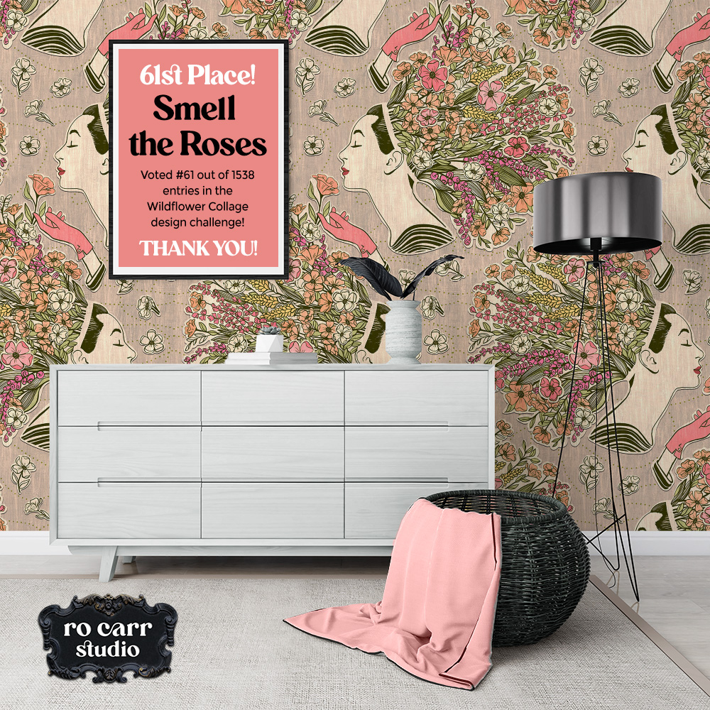
While top 25% is awesome, I’m working toward a consistent top 10% result, so this week I did not meet that goal.
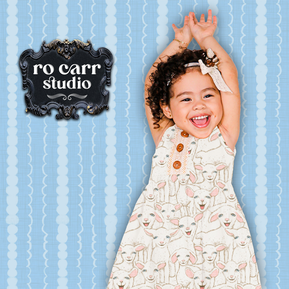
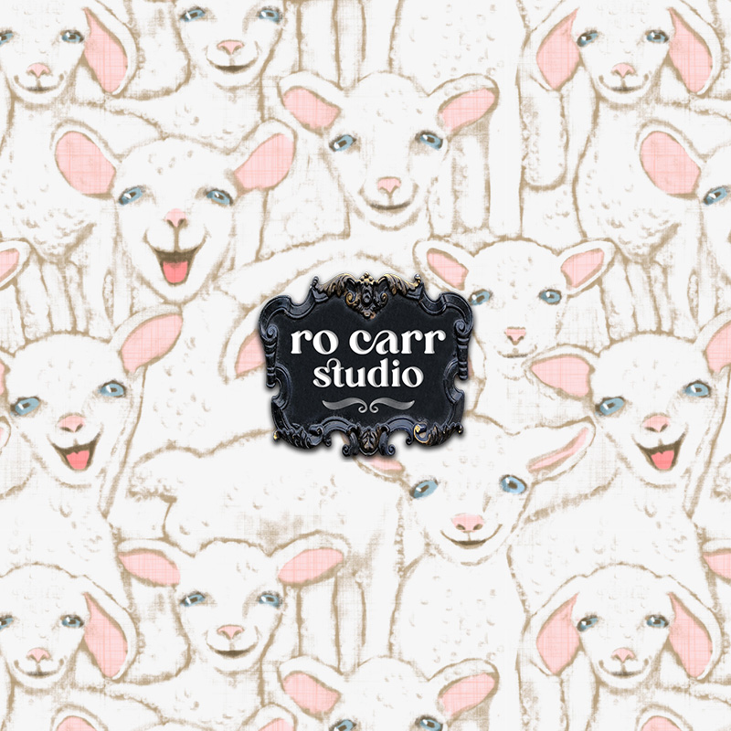
This was not unexpected. After many months of competing with so many talented artists, I can see that my work rarely skews cute. If it does, it’s a rather off-center, atypical brand of cute. While I do think my Cute Kids collection is super cute, compared to the other designers’ entries, my lambs are just on a different wavelength.
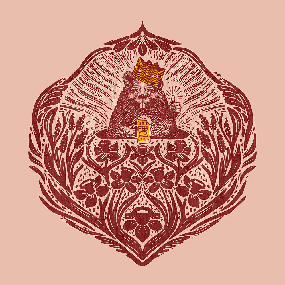
I saw the same with the Monster Mash competition a few weeks ago. I went for creepy clown monsters when 95% of the other designers went for adorable candy colored monsters. Cute just doesn’t register for me when I’m designing – my ideas go in a different direction.
Live and learn! I will continue entering challenges, especially those that don’t necessarily fit my aesthetic. If anything, it helps me to expand and grow my sensibilities and skills, and it also helps me define where I fit into this huge industry of surface pattern design.