A friend who rides with a cycling group asked me a simple question: do you have any designs with bicycles? Easy, I thought. I’ve designed more than 1,800 patterns. Surely a bicycle has rolled through one of them at some point. It had not. Not one bicycle. Not a lone wheel leaning against a garden wall. Not even a unicycle in the background.
In my defense
I am decidedly un-sporty. My interests as an artist run toward the natural world, cultural influences, historic eras and vintage finds. If it blooms, migrates, or turned up at an estate sale, I’ve probably drawn it. If it requires a helmet, less likely.
The lone exception in my catalog is the Preppy Vintage Badminton collection I designed for Spoonflower’s Court Sports challenge a couple of years ago. Even when handed an entire category of sports, I went straight for the preppy vintage angle. Go figure.
So a bike print was overdue. Then Spoonflower announced its Patchwork Revival challenge, and an idea began to take shape.
Building the wheel
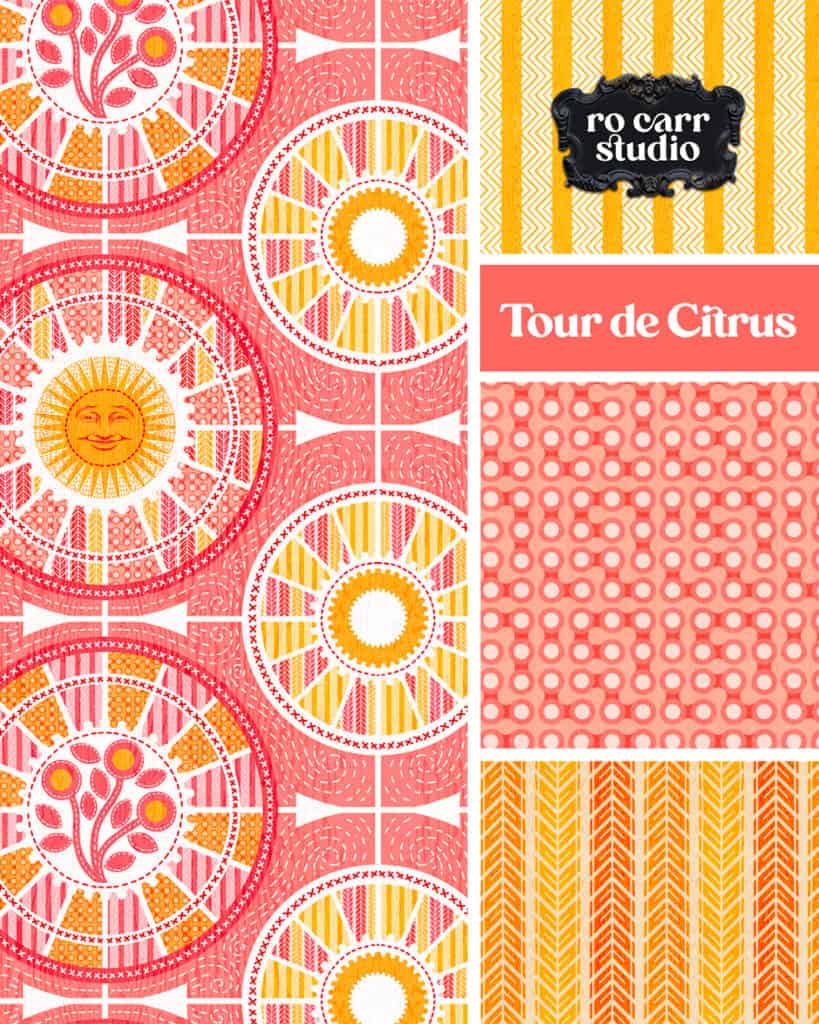
I started with the wheels. Spokes turned out to be very cooperative patchwork. They divide a circle into neat wedges, just like a Dresden Plate, a classic quilt block made of fabric wedges radiating from a center circle. It was hugely popular in the 1920s and ’30s, when quilters pieced it from whatever scraps they had on hand. It also goes by Grandmother’s Sunburst, which seems fitting for a design that ended up with a sun in it. Mine is basically a Dresden Plate that took up cycling.
Each wedge of my wheels needed a fill, and since this was supposed to be a bike print, the fills became bike patterns: chain links and variations on tire treads. Gear shapes worked their way in, ringing the centers and edges, and I am loving how they also look a little like petals.
The stormy period
I worked up most of this design in blue and gray. It looked like a bike print, which was the goal. In dark gray, the tires read easily as actual tires. It was accurate. It was also a little like a rainy Saturday spent in the garage.
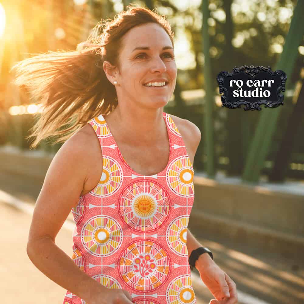
Then I tried a warm pink colorway, and suddenly the stormy day turned sunny and happy. The wheels also stopped looking like wheels and started looking more like grapefruit slices.
I had a choice to make. I could go back to the gray and keep the recognizable bicycle, or I could follow the fruit. The warm pink felt so joyous. I could feel the summer sunshine, smell the cut grass, hear the kids laughing. Clearly, happy wins the day.
Most of my design process is feeling my way around in the dark until something clicks. I’ve learned to trust that click, even when it takes me somewhere I didn’t plan to go. That’s where my voice as an artist comes from. So my first bike design turned out a little fruity, and it’s more me because of it.
A happy summer ride
Once the design was sunny, it seemed only fair to add a sun. He has a face, and he’s smiling, because he’s not the one pedaling uphill. I added some flowers as appliqué, the kind you’d pass along a country road. Then came the stitches, which is what really turned it into patchwork for me: cross-stitched borders, running stitches, and quilting stitches that swirl around the wheels like a breeze on a good ride.
About that name
Tour de Citrus is part Tour de France and part grapefruit, which is pretty much the design in a nutshell. Or an orange peel.
This un-sporty person couldn’t tell you much about the Tour de France. But the word “tour” I can get behind. A tour isn’t a race. It’s a ride with no particular hurry. You feel the wind in your hair (please wear a helmet), watch the road curve ahead, and find something new around every turn: a garden you’ve never noticed, a wooded path through the park, the smell of wood smoke from a backyard fire pit.
That’s the feeling I wanted in this design. Less finish line, more summer afternoon. It’s the kind of ride where nobody checks the time.
What’s next
Tour de Citrus is my entry for Spoonflower’s Patchwork Revival challenge, and you can shop the collection on Spoonflower. I’ll be filling out the collection with more colorways, so check the Tour de Citrus design page as those roll in.
And to my cycling friend: I finally have a bike print. It just happens to look a little like breakfast.