Wait — take 15% off your first order.
Join the First Look Club and see new designs before anyone else.
I add texture to almost everything I design. Grasscloth, linen, a little grit wherever it’ll fit. At this point it’s less a technique than a habit. So naturally, when Spoonflower announced an Added Texture challenge, I struggled to finish a design for it. Nothing makes your comfort zone feel unfamiliar quite like being handed it as an assignment.
What finally got me unstuck was an old favorite: Lilly Pulitzer.
If you don’t know the Lilly origin story, it’s a good one. In the late 1950s, Lilly Pulitzer was a Palm Beach socialite whose husband owned citrus groves. She did what anyone would do with a surplus of oranges and opened a juice stand just off Worth Avenue. Squeezing juice all day was hard on her clothes, so she had her dressmaker make simple sleeveless shifts in loud, cheerful prints that hid the stains.
Customers started asking about the dresses. Soon the dresses were outselling the juice. Then Jackie Kennedy, an old classmate, was photographed in one in Life magazine, and the juice business never stood a chance.
The “Lilly” became the unofficial uniform of Palm Beach: bright, unbothered, pink and green, and ideally worn barefoot. It’s been a big inspiration for me for years. This isn’t even my first trip down Worth Avenue. My Palm Beach Garden Party collection, with its trellis garden, cockatoos, and gingham, came from the same obsession. It was voted #51 out of 1,268 entries in Spoonflower’s Preppy Wallpaper challenge, which I mention purely for context and not at all to brag.
The other culprit is Palm Royale. If you haven’t watched it, Kristen Wiig plays Maxine, a former pageant girl from Tennessee scheming her way into Palm Beach high society in 1969 by way of the town’s most exclusive country club. The plot is twisty and the cocktails are strong. For a pattern designer, the real danger is that every frame looks like a mood board. Wallpaper, upholstery, caftans, poolside everything, all turned up to eleven and none of it apologizing. Watching it is super fun. It’s also research.
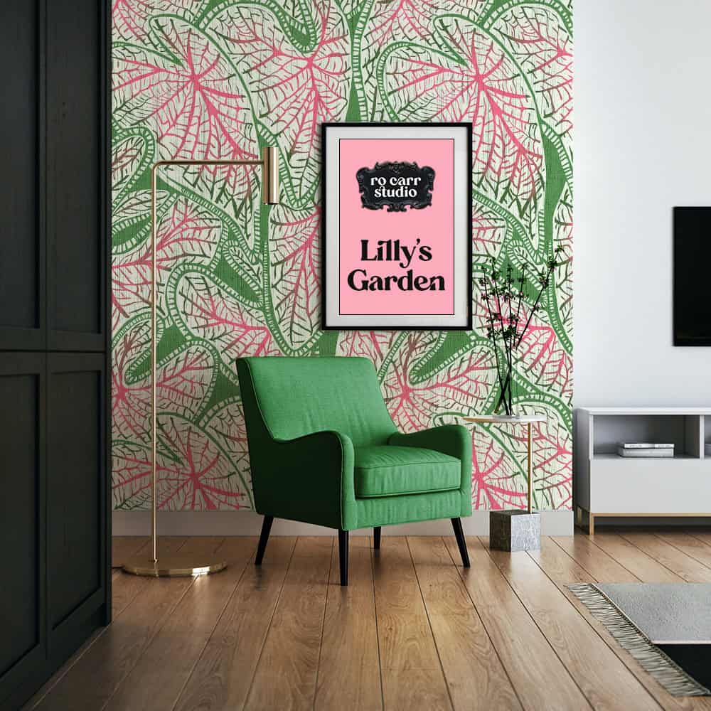
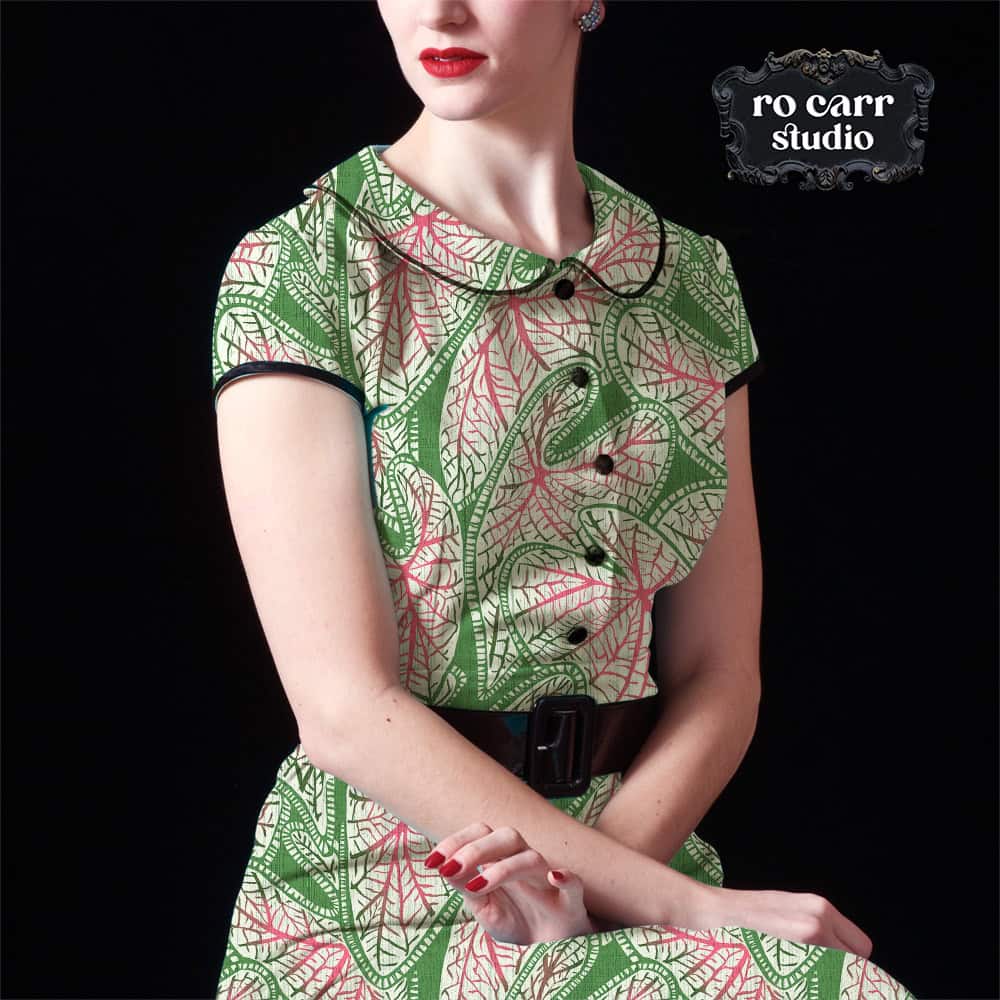
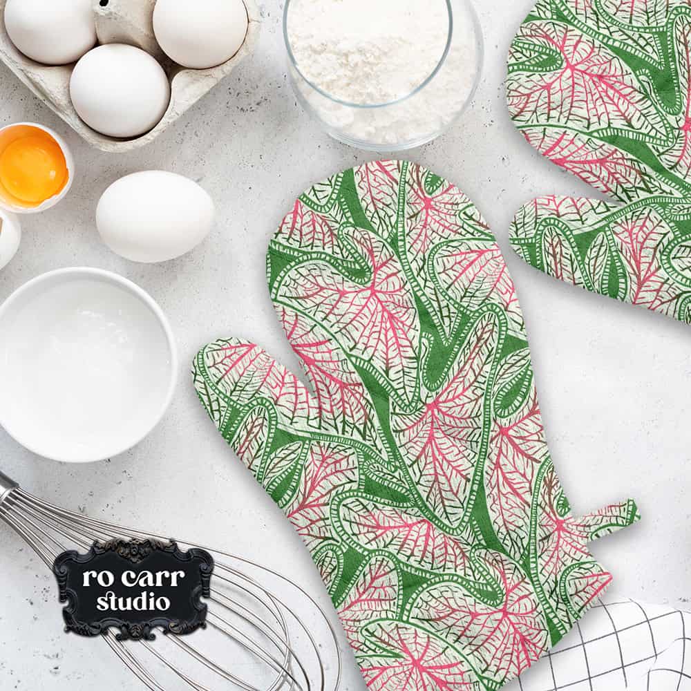
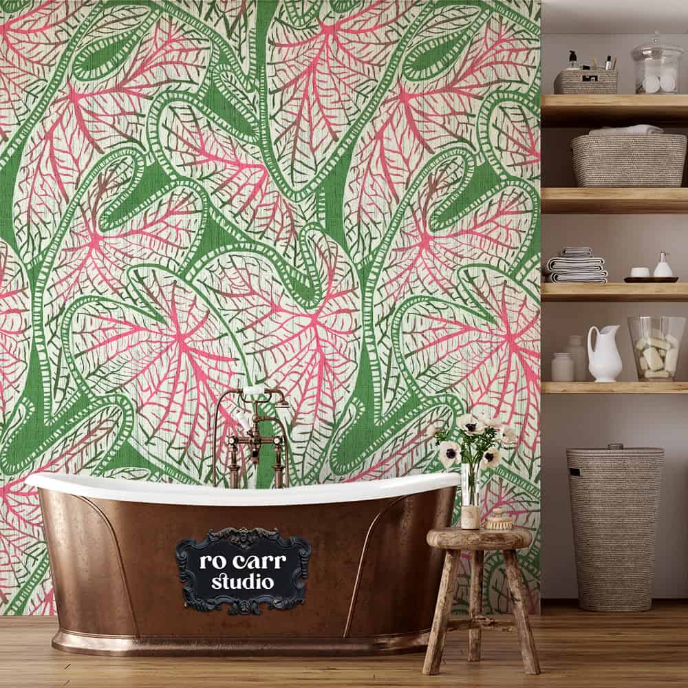
Lilly’s Garden is a field of caladium leaves, the big heart-shaped tropicals with veins that look as if someone drew them in with a fine pen. I drew mine in a carved block print style, with branching veins and banded edges that wind through the whole repeat like ribbon. Then, because the challenge demanded it and because I genuinely can’t help myself, I layered on a mix of grasscloth and linen textures.
The result feels handmade rather than polished, like something that’s been hanging in a Palm Beach powder room since 1969 and has earned the right to stay there.
This print is an homage to one of my favorite fashion icons: bright, graphic, and absolutely club-worthy.
Lilly’s Garden currently comes in four colorways: the original pink and green, plus Coral, Aqua and Ocean Blue. and a growing collection of coordinating prints. If you’d like to see them before anyone else, the First Look Club is the place to be.
See the full collection on the Lilly’s Garden page, or shop the wallpaper and fabric on Spoonflower.
Now, if you’ll excuse me, I have some coordinates to finish. Barefoot, obviously.